
Value studies in grayscale before color
Plan a picture in three to five grays, test it with a squint and a grayscale check layer, then bring in color with blend modes without losing the read.
Color gets the compliments. Value does the work. When a picture reads from across a room, or a comic panel tells you instantly where to look, that is almost always because the lights and darks are arranged clearly, and the hues are riding along on top.
Value means how light or dark something is, separate from its hue or saturation. A red barn and a green field can be exactly the same value, and in grayscale they melt into one shape. That is why I plan in gray first. It removes the most distracting variable and leaves the one that decides whether the picture reads.
This piece covers how many grays to use, how to check them, and how to get color on top without wrecking the plan.
Fewer values than you think
Your screen can show hundreds of grays. A value study wants three to five.
Three values: light, middle, dark. This is the thumbnail and layout stage. It forces you to group things: everything in shadow becomes one dark, everything lit becomes one light, and the middle holds the rest. If a composition does not work in three values, more values will only blur the problem.
Five values: add a light-middle and a dark-middle. This is enough for a finished-looking study with form, cast shadows and a sense of atmosphere. Past five, you are rendering, not planning.
Keep pure white and pure black out of the main plan. Save them for tiny accents: a highlight on an eye, the deepest crack in a doorway. In comics, solid black is its own tool, and spending it everywhere flattens the page.
Make a value strip once
Pick your grays once and keep them as swatches, so you are not inventing a new middle gray every time.
Here is the worked example I use. In the color picker, set saturation to 0 and pick five brightness values:
| Step | HSB brightness | Use |
|---|---|---|
| 1 | about 15 percent | Deepest shadow masses |
| 2 | about 35 percent | Shadow side of forms, dark local colors |
| 3 | about 55 percent | Middle: most midtones, background masses |
| 4 | about 75 percent | Lit side of forms, light local colors |
| 5 | about 92 percent | Light sources, sky, lit highlights |
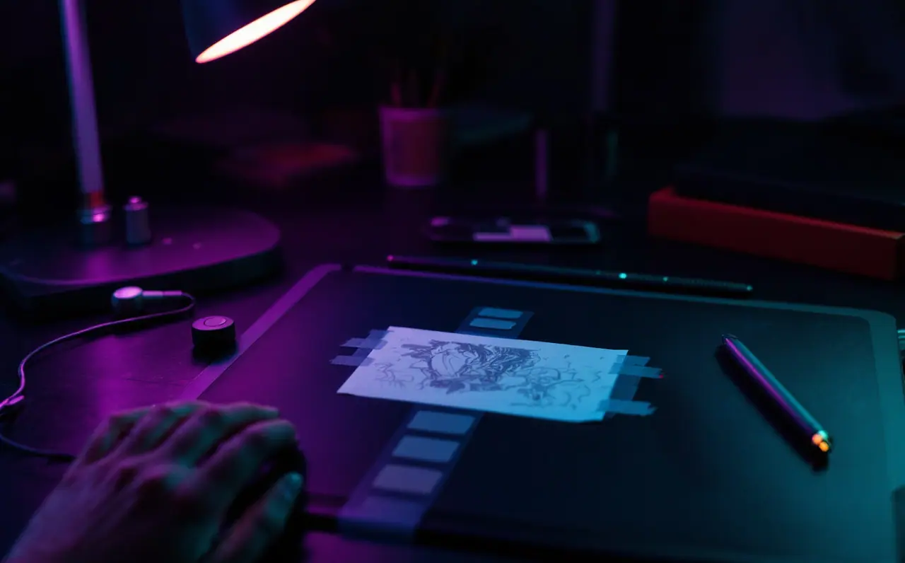
The exact numbers matter less than the even gaps between them. Paint the five as blocks on a small strip, save it as a palette, and you are done. I also keep a printed version taped beside the tablet, mostly so I can look at it while thinking with a pen in my hand.
One warning. HSB brightness only tracks perceived lightness reliably at zero saturation. A fully saturated yellow and a fully saturated blue at the same brightness number look nothing alike in value; the yellow is far lighter. Remember that when color arrives.
The squint test
The oldest check, and it costs nothing. Squint at your picture until the details blur. What is left is the value structure. Ask:
- Do I see three or four big shapes, or confetti?
- Is the strongest contrast at the focal point?
- Does the silhouette of the main figure separate from what is behind it?
Squinting at a screen works, but there are digital versions too. Zoom out until the picture is tiny. Open a second, small view of the canvas: Krita can open a new view of the same document, Photoshop can open a second window of it, and Procreate has a reference window in its canvas actions that can show the whole canvas. Flip the canvas horizontally now and then for fresh eyes.
A grayscale check layer
Once color is involved, you need a switch that shows the picture in gray on demand. Make one layer at the very top of the stack and leave it there, hidden, until you want it.
- In most apps: fill a layer with any neutral gray (or black) and set it to the Color or Saturation blend mode. Everything below displays in grayscale. This works in Procreate, Krita, Clip Studio Paint and Photoshop.
- In Photoshop, a Black & White adjustment layer or a Hue/Saturation adjustment with saturation at minimum does the same job.
- In Krita, a filter layer with a desaturate filter is another route.
- In Clip Studio Paint, a tonal correction layer for hue, saturation and luminosity works too.
Different methods give slightly different grays because each app weighs red, green and blue its own way. Pick one method and stick to it, so your eye learns what that particular gray conversion looks like. If you suspect your screen is lying to you about darks, the guide to calibrating a monitor for drawing helps.
From gray to color
There are a few ways to add color on top of a gray study. None is perfect. The table sums up how they tend to behave.
| Method | How | Keeps values? | Typical problem |
|---|---|---|---|
| Color blend mode layer | Paint hues on a layer set to Color above the grays | Mostly | Darks and lights look gray and muddy; saturated areas can drift in value |
| Overlay or Soft Light layer | Paint hues on a layer in these modes | Partly | Shifts contrast, often brightening lights and darkening darks |
| Gradient map | Map dark grays to one color and light grays to another | Yes, if the gradient is ordered by value | Can look like a filter if left untouched |
| Repaint over a guide | Keep the grays on a hidden layer and paint opaque color on a new layer, matching values with the check layer | Yes, when you check often | Slowest, and the most control |
What I actually do: gradient map or Color layer first, to get the whole picture into color quickly, then a new normal layer on top where I repaint the important areas with opaque color, flicking the grayscale check layer on every few minutes. The quick methods get you most of the way. The repainting is where it starts to look like a painting instead of a tinted drawing.
For more on how these modes calculate, layers and blend modes for painters goes through them one by one.
A worked panel
A comic panel I sketched for a short story: a kid stands in a dark bedroom doorway at night, lit from the hallway behind.
Three-value plan:
- Dark (step 1 or 2): the whole bedroom, including the bed and the floor.
- Middle (step 3): the kid's figure, seen against the light, mostly in shadow.
- Light (step 5): the hallway, a rectangle of light, plus a light spill on the floor.
Squint, and the panel reads at once: a bright rectangle with a figure inside. That is the whole story beat, done in three grays.
Then color. A Color layer: deep blue over the bedroom, warm orange over the hallway and the spill. Flick the check layer on. Problem: the orange hallway is fine, but the blue I chose made the bedroom read darker than planned, and the kid now merges into it. Fix: lift the kid's value a step on a normal layer, with a cool rim of hallway light along the shoulder. Check layer again. Rectangle, figure, done.
The fix took two minutes because I knew what the gray plan was supposed to look like. Without the plan, I would have been staring at a muddy panel without knowing why.
Habits that help
- Do value studies small. A box a few centimeters across on screen is plenty for three values.
- Limit yourself to the swatch strip. No picking new grays mid-study.
- Plan the focal point as the place where your lightest light meets your darkest dark.
- Keep the grayscale check layer in your template so it is always there.
- Study other artists' work in grayscale: drop an image onto a canvas and switch on the check layer. Film stills are especially good for this.
For books, Marcos Mateu-Mestre's Framed Ink is built around composing in black, white and grays, which suits comics people well. James Gurney's Color and Light covers the bridge from value to color in more depth, with plenty of painted examples. More on all of this lives in the techniques section.
Last habit, the one that matters most: when a colored picture looks wrong and you cannot say why, switch on the gray layer before touching a single hue. Most of the time the problem is a value, and most of the time it takes one stroke to fix.

Wren Talbot
Wren draws comics and spends far too long on line weight. Wren writes the technique and practice pieces: inking, values, light, references and habits that survive a busy week.
More from the same shelf
Sketching a bathroom remodel to scale in Krita or Procreate
Set up a scaled canvas, draw the plan and walls on named layers, and hand a remodeler a drawing that says what you want before the first meeting.
Open the piece →
Getting canvas size and DPI right for print before you start
How to turn a print size into pixels before you paint: the one formula, worked examples for 8 x 10 and A4, bleed, aspect ratios and what 300 DPI really means.
Open the piece →
Layers and blend modes for painters who hate menus
Multiply, screen, overlay, color, clipping masks and alpha lock explained for painters, with a short layer workflow that keeps a painting tidy and editable.
Open the piece →