
What your studio walls are doing to your colors
A colored wall tints how you judge color on screen. Run a simple gray-step test, then pick a neutral, low-glare finish for the wall behind your desk.
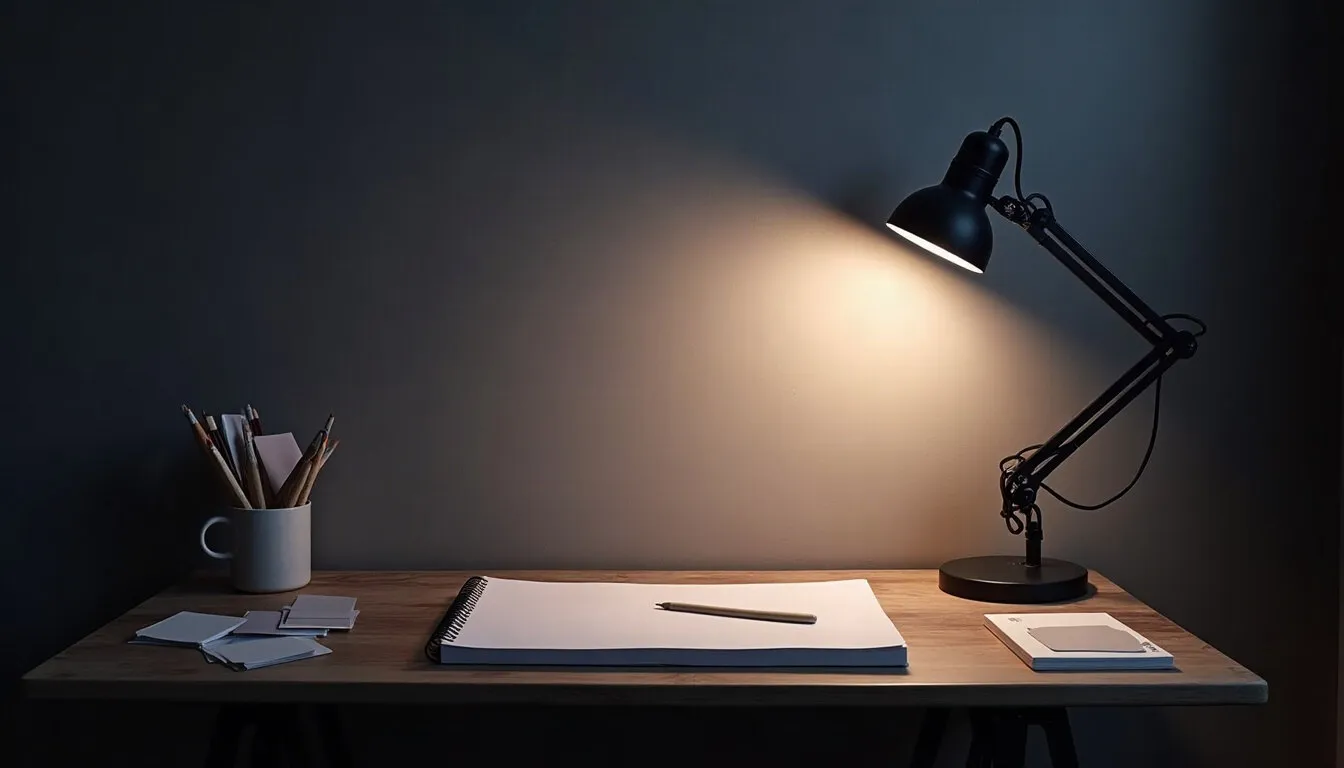
For a year I couldn't work out why my skin tones looked fine at night and sickly green the next morning. The monitor hadn't changed. The wall behind it had: a cheerful sage that bounced green daylight onto everything on my desk, including me.
Wall color is part of your color workflow whether you like it or not. Planning a repaint with a painting contractor Colorado Springs homeowners can call locally goes faster when you already know what the studio wall has to do. This article sets out how walls affect what you see, a simple test you can run with a drawing file, and the questions worth bringing to whoever does the painting.
How a wall gets into your colors
Your eyes adapt to the room. When light reflects off a strongly colored wall, it tints the desk, the paper, your hands and the surround of the screen. Your visual system quietly corrects for that tint, and the correction carries over to how you read the colors on the display. The screen itself is unchanged; your judgment of it is not.
Three properties of a wall matter most for this:
- Hue: a saturated wall (sage, terracotta, sky blue) pushes its color into the room. A neutral one doesn't.
- Lightness: a very dark wall next to a bright screen makes the screen feel brighter and harsher; a very white wall can feel glaring beside it.
- Sheen: glossy finishes reflect lamps and windows as bright patches, which show up as glare on a pen display or a glossy monitor.
Which is why studios for color work tend toward neutral, mid-light grays with a flat or matte finish. You don't need a gray box. You need the wall nearest your screen, and the one you face, to stay out of the conversation.
In a place with bright, high, dry sunlight like Colorado Springs, daylight can be strong and clear for much of the year. Strong light makes a colored wall's reflection stronger too, so the wall matters more, not less.
Pressure check
- Light touch: hold a white sheet of paper against the wall behind your screen and see what color it picks up.
- Press firmly: keep the wall you face while drawing neutral in hue.
- Lift off: repainting the whole house. The studio walls are what count.
Running a gray-step test before you choose
This is my favorite part, because it turns a vague worry into a file. You will make a small swatch chart, look at it under your real conditions, and note how it shifts.
Here is the worked example:
- Make a new canvas, 1,100 by 300 pixels.
- Divide it into 11 squares, each 100 by 100 pixels, in a row with a 100-pixel strip of pure white beneath.
- Fill them from black to white in even steps: 0, 10, 20 and so on up to 100 percent lightness. In Krita or Clip Studio Paint, set the brightness slider in HSV or HSL; any app with a numeric color picker works.
- Below the steps, add three skin-tone swatches and one sky-blue swatch you use often.
- Save the file as "wall test" and open it full screen at three times: morning, mid-afternoon and evening, with the lights you normally use.
At each sitting, write down which gray step looks truly neutral and which looks tinted, and whether the skin swatches look warm, cool or off. If the middle grays look slightly green in the morning and fine at night, the wall (or the window) is tinting your view. If they look fine all day, your wall is doing its job.
Then bring physical paint chips from a store into the same spot and hold them beside the screen. Pick the gray that looks quietest next to your middle gray steps. Screens and paint never match exactly, so you are looking for a neighbor that doesn't argue, not a twin.
Pressure check
- Light touch: run the test once in the morning and once in the evening before you buy anything.
- Press firmly: judge chips in the studio, next to the screen, in your real light.
- Lift off: matching a paint color to a specific RGB value. It won't hold up across lighting.
What to settle with the painter
Once you know roughly which neutral you want, the next decisions are practical. A professional painter handles prep, coverage and finish far better than a weekend with a roller, especially on walls with old patches or a ceiling that needs care. Their job is to deliver the wall; your job is to tell them what the wall has to do.
Here is the comparison I use when talking finishes:
| Finish | Glare near a screen | Wipes clean | Where it suits a studio |
|---|---|---|---|
| Flat or matte | lowest | least | the wall behind and facing the screen |
| Eggshell | low | moderate | other studio walls |
| Satin | noticeable | good | trim, doors, busy hallways |
| Gloss | high | easiest | avoid near the desk |
Questions worth asking the painter:
- Which neutral grays do they suggest for a room with strong daylight, and can they apply sample patches on the actual wall?
- Which finish do they recommend for low glare on the screen wall, and how washable is it?
- Should the ceiling be a plain white or a slightly toned version of the wall color?
- How long until the room can be used, and how long should it air out before you set up electronics and paper again?
That last question matters to an artist. Fresh paint smell in a closed studio is unpleasant during a long session, so ask what ventilation they suggest and plan a few days off from the desk.
It also helps to show the painter your setup. Point out where the desk sits, where the screen faces and which window brings in the strongest light. A painter who knows the wall behind the monitor is the one that matters can suggest where a sample patch will tell you the most, and where a slightly different finish is worth it.
Small surfaces that tint the work
Walls are the big surfaces, but smaller ones add up. People repaint carefully and then put a bright orange chair right next to the desk.
Look at the desk surface first. A glossy white desktop bounces lamp light straight into your eyes and onto the display. A mid-gray or wood-toned matte surface is calmer. A large matte desk mat can solve this without buying anything else.
Then the things behind the screen. Shelves full of colorful book spines are lovely, but they sit in your peripheral view for hours. If you do color-critical work, consider a neutral curtain or a plain panel behind the monitor, and keep the colorful shelf to the side.
Then lighting. A neutral wall under a very warm bulb still reads warm. If your lamps are mixed (one warm, one cool), the wall shows two colors at once and your test from the previous section will look different on each side of the room. Try to keep the bulbs near the desk consistent.
Finally, your own clothes. A bright shirt reflects onto a glossy pen display surprisingly well. You don't need to dress in gray, but if a color session looks off, it is one more thing to check.
Pressure check
- Light touch: swap a glossy desk surface for a matte mat.
- Press firmly: match the bulbs around your desk so the wall reads one color.
- Lift off: getting every object in the room neutral. Peripheral color in moderation is fine.
Before you put the pen down
A studio wall works best when nobody notices it: a neutral, mid-light gray with a flat finish near the screen, under consistent light. The gray-step test tells you whether your current wall is helping or quietly tinting your work, and good chips judged in the actual room tell you what to paint next. The prep and the brushwork are for a professional painter.
Today, make the 11-step gray file, open it full screen and look at it at the time of day you draw most. Write one sentence about what you see. That sentence is your brief for the repaint.

Idris Kalu
Idris likes opening every menu in a program before deciding what it is good for. He writes about Krita, Clip Studio Paint, file formats, canvas sizes and preparing work for print.
More from the same shelf
Preparing digital art files for prints, step by step
Color profiles, soft proofing, CMYK, bleed and test prints, in the order I do them, so the print that arrives looks like the painting you made on screen.
Open the piece →
Sharing a garage studio with an electric car charger
How to map a garage studio before an EV charger goes in, what to tell the electrician about your gear, and the habits that keep the room usable.
Open the piece →
A drawing desk setup that is kind to your wrists
A ten-point desk check for digital artists: desk and chair height, tablet angle, mapping, gloves, light and breaks, with a worked desk height example.
Open the piece →