
Preparing digital art files for prints, step by step
Color profiles, soft proofing, CMYK, bleed and test prints, in the order I do them, so the print that arrives looks like the painting you made on screen.
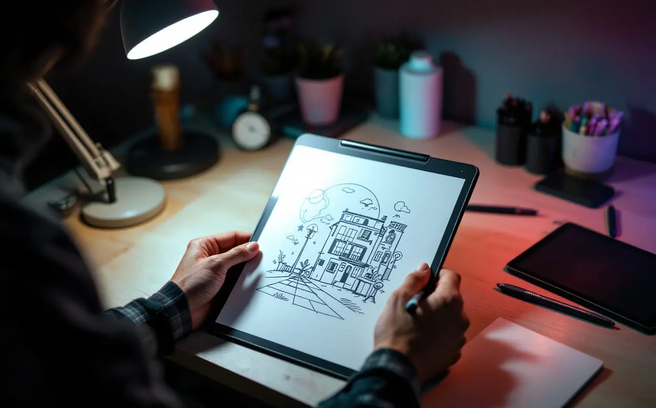
The first print I ever ordered of a digital painting came back darker, duller and slightly greener than the file. Nothing was wrong with the printer. The screen I painted on was bright, backlit and set to a color space the shop never asked about, and the paper simply could not glow the way a monitor does. A print reflects light; a screen emits it. Most of the work in preparing a file is closing that gap on purpose instead of hoping it closes itself.
What follows is the order I work in. It looks like a lot of steps, but most of them take a minute once you have done them twice, and the slow ones (soft proofing and the test print) are the ones that save the money.
Step 1: Decide the print size before you touch the file
Everything downstream depends on the physical size, so start there. Print shops usually want around 300 pixels per inch at the final size for prints viewed up close. Large posters seen from across a room can get away with less, but ask before assuming.
A worked example. Say you want an 8 by 10 inch print, and the shop asks for 0.125 inches of bleed on every side. The trimmed print is 8 by 10, but the file needs to be 8.25 by 10.25 inches:
- 8.25 inches x 300 ppi = 2,475 pixels wide
- 10.25 inches x 300 ppi = 3,075 pixels tall
If your painting is 2,400 by 3,000 pixels, you are a little short. You can upscale slightly (a few percent rarely shows on textured paper), extend the background into the bleed by hand, or choose a slightly smaller print. If you are planning a new piece for print, set the canvas up correctly from the start; the canvas calculator does this sum for any size, and the launch guide to canvas size and DPI for print covers the reasoning in more depth.
Check the aspect ratio too. A painting made at 3:4 will not fill an 8 by 10 sheet without cropping or a border. Decide which before you upload, because the shop's automatic crop will decide for you otherwise.
Step 2: Ask the printer exactly what they want
Every shop has a file specification page, and it is worth reading slowly. The questions I look for answers to:
- RGB or CMYK? Many fine art inkjet (giclee) printers prefer RGB files and handle the conversion themselves. Offset and commercial digital presses usually want CMYK.
- Which color profile? Some shops publish their own ICC profiles for each paper. Others name a standard profile, such as a FOGRA or GRACoL press condition.
- How much bleed, and how much safe margin inside the trim?
- Which file formats? TIFF and PDF are the usual answers. JPEG at maximum quality is sometimes accepted.
- Flattened or layered? Almost always flattened.
If the shop offers paper profiles for download, take them. They are the closest thing you have to seeing the paper before you pay for it.
Step 3: Get your working color space in order
Most digital painting happens in sRGB, and for most prints that is fine. Some painters work in Adobe RGB or Display P3, which hold more saturated greens and cyans. The trouble starts when a file has no embedded profile at all, because then the shop has to guess what the numbers mean, and the guess is usually sRGB.
Two rules I follow:
- Know which space your file is in. In Photoshop it shows in the document info; in Krita it is listed under the image properties; in Clip Studio Paint it sits in the color profile settings for the canvas.
- Embed the profile on export. Every serious export dialog has a checkbox for it. Leave it ticked.
Procreate works in sRGB or Display P3 depending on the canvas you created, and it exports with the profile attached. If you painted on an iPad, move the file to a desktop program for the proofing steps below, since that is where the proofing tools are.
Step 4: Make your screen tell the truth
Soft proofing is only as good as the monitor showing it. An uncalibrated screen at full brightness will make every proof look wrong in a way you cannot correct for. If you have not done it, read the guide to calibrating a monitor for drawing first.
For print work specifically, I lower the screen brightness well below what I paint at. Calibration guides commonly suggest somewhere around 80 to 120 candelas per square meter for print matching, which looks dim at first. Within a few minutes your eyes adjust, and the screen stops lying about how bright the shadows will be on paper.
The room matters as much as the monitor. I look at proofs and prints under the same lamp: a daylight-balanced bulb with a high color rendering index, pointed at the desk and not at the screen. Mixed light from a window and a warm ceiling bulb will make the same print look like three different prints over an afternoon.
Step 5: Soft proof
Soft proofing simulates on screen how a file will look on a particular paper with a particular printer, using that paper's profile. It will never be perfect, because a screen cannot become matte paper, but it shows you where trouble will appear.
Where to find it:
- Photoshop: View, then Proof Setup, then Custom, where you choose the shop's profile. Toggle it with Proof Colors.
- Krita: in recent versions there is a soft proofing toggle in the View menu, with the profile and rendering intent chosen in the image or canvas settings.
- Clip Studio Paint: a color proof option in the View menu, set up in the color profile preview settings.
Menu names drift between versions, so if you cannot find the option, search the program's help for "soft proof".
When you switch the proof on, three things usually happen. Saturated blues and greens flatten. Deep shadows merge into one dark mass. Pure white becomes the color of the paper, which on a warm cotton stock is noticeably cream. The gamut warning (an overlay that marks colors the paper cannot reach) shows you exactly which areas are affected.
Choosing a rendering intent
The two you will see most:
| Intent | What it does | When I use it |
|---|---|---|
| Perceptual | Compresses all colors a little so out-of-range colors fit, keeping their relationships | Saturated paintings with lots of out-of-gamut color |
| Relative colorimetric | Keeps in-range colors exact and clips the out-of-range ones to the nearest printable color | Muted palettes where little falls outside the gamut |
Try both with the proof on and pick whichever keeps the area you care about most, usually a face or the focal light.
Adjusting for the print
I never edit the master file for print. I save a copy named for the paper and the shop, then make corrections with adjustment layers: a gentle curves lift in the shadows (prints almost always come out darker than the screen), a small saturation pull in the one hue that clips worst, sometimes a touch of warmth removed if the paper is cream. Small moves. If you need a large correction, the problem is usually the screen, not the file.
Step 6: Convert to CMYK only if asked, and only at the end
If the shop wants RGB, skip this step entirely. Converting yourself just throws away color the printer's own conversion might have kept.
If they want CMYK, convert the flattened print copy using the exact profile they named, with the rendering intent you chose while proofing. Do it as the last color operation, not partway through the painting, because CMYK mode limits blend modes and filters in many programs.
Two things to check after converting. Text and line art that should be pure black often come out as a muddy four-color mix; shops differ on how they want black handled, so follow their specification for black type and large black areas. And the shop may state a total ink limit. If they do, the profile they supplied usually respects it already, which is one more reason to use their profile and not a generic one.
Step 7: Add bleed and respect the safe margin
Bleed is the strip of image beyond the trim line that gets cut off. It exists because cutting is never perfectly accurate, and a print trimmed a hair off center will show a white sliver at one edge if the image stops exactly at the trim.
Extend the background into the bleed by painting it out, not by stretching the whole image. Then keep anything important (a signature, a hand, a horizon) inside the safe margin, which is the area well inside the trim. I put guides at the trim and the safe line on a hidden layer so I can check them on every revision.
Step 8: Export cleanly
- Flatten the print copy, or export a flattened version.
- Use TIFF (uncompressed or with lossless LZW compression) or the PDF preset the shop recommends.
- Embed the color profile.
- Name the file with the size, the paper and the version, for example "harbor-8x10-cotton-v2.tif". Shops receive a lot of files called "final".
Open the exported file again before uploading. I have caught a hidden sketch layer, a missing bleed and a wrong profile this way, each once, which was enough.
Step 9: Order a test print
A soft proof is a forecast. A test print is the weather. Before ordering an edition or a large size, order one small print on the same paper, or ask whether the shop sells proof strips.
When it arrives, look at it under your daylight lamp next to the screen at your print brightness. Compare the shadows first, then the most saturated color, then the whites. Make your corrections on the print copy, note what you changed, and order again if the changes were large.
Step 10: Write it down
Keep a small text file next to your print copies: the shop, the paper, the profile, the rendering intent, the shadow lift you needed and how the test print looked. The second time you print with the same shop, most of this guide shrinks to opening that note. After a few orders you will know, for example, that a particular matte paper always wants the shadows lifted a little and the blues pulled back slightly, and you can build that into the copy before you even turn the proof on.

Margo Ellery
Margo cares about what surrounds the drawing: monitors, color calibration, desk height, lamps and the books she keeps returning to. She writes the studio and setup guides.
More from the same shelf
What your studio walls are doing to your colors
A colored wall tints how you judge color on screen. Run a simple gray-step test, then pick a neutral, low-glare finish for the wall behind your desk.
Open the piece →
Planning a group sketch trip for digital artists who hate driving
Plan a group sketch day in the mountains: what to ask a charter company, how to pack a tablet for cold and glare, and how to keep the day about drawing.
Open the piece →
Setting up a patio for drawing outside without a wobbling chair
How to size, shade and place a patio corner for outdoor drawing, so the chair stays level, the screen stays readable and the gear gets inside fast.
Open the piece →